Restuctuing Code and New Artstyle
Intro
During the last two weeks I managed to restructure the code based off of the new UML diagram and clean up a lot of the spaghetti code. Because of cleaning up a lot of the code, I also managed to fix some bugs surrounding the Cauldron system which I was really happy with! Also, I did have time to look over the artstyle and while I did find some good isometric assets I could use, I have decided to go with a slightly different angle of isometric. Because I talked a lot about the code restructuring and the class diagram in my last post, this post is mainly going to be focused on the change and artstyle.
New Style Vs. Old Style
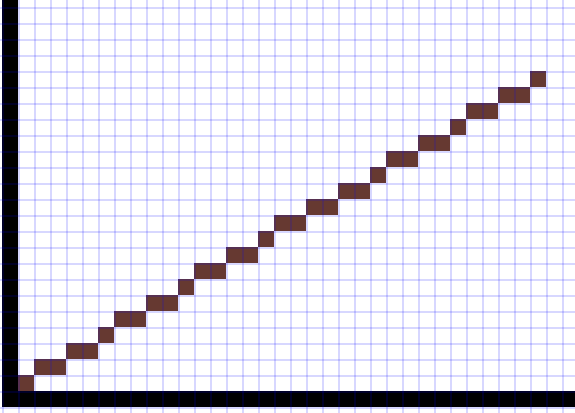
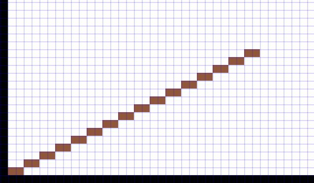
While I am still keeping the isometric look, I am changing the angles that each grid space occupies. For those who are unfamiliar with isometric art/pixel art, true isometric angles are set at 30° with each square's left and right corner angles each at a total of 60° and the top and bottom at 120°. However in pixel art having the exact angles being 30° makes the edge of the space look too jagged so instead we shorten it to 26.5° to make the edges cleaner.

True Isometric (30°)

Pixel Art Isometric (26.5°)
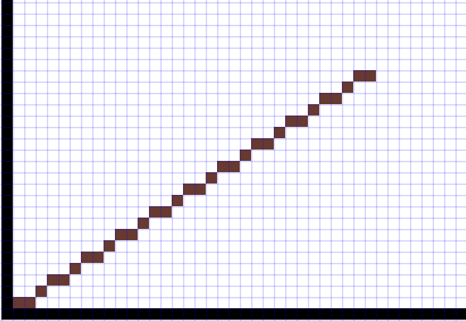
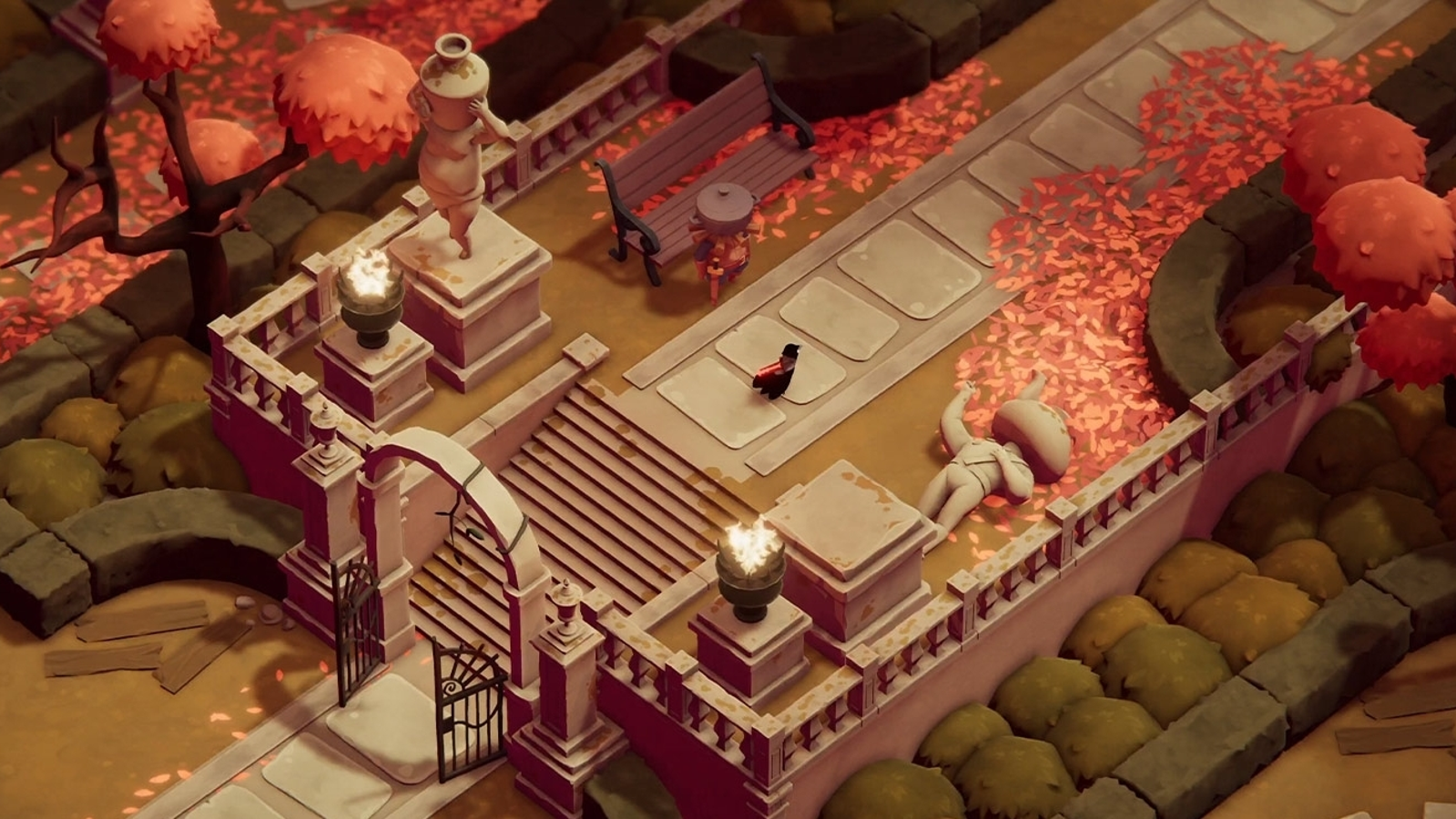
The main change that I am making is to increase the angles of the left and right corners to roughly 70° instead of the standard 60°. I personally like the look of this style more and one of my main inspirations for this is from the game Death's Door which uses this expanded isometric style.

Changed Isometric (~35°)

Death's Door
I really want the player to be able to see more of the ground than the sides of objects which is one of the main reasons for the change. I really wasn't happy with the current perspective and I feel like a straight top down perspective would make the game feel a little flat and hard to differentiate herbs and creatures that are close together.
Next Sprint: Add Temp Assets and Clean Up Functionality
The first thing I want to accomplish for the next sprint is to implement the same assets just in the new perspective. I've already started working on some assets and I'm not expecting this to take much time. I'm also planning on going a simpler route and I won't be spending as much time on the new assets as I did in the old ones.
After I finish that up I'm going to start cleaning up the currently implemented functionality of the current systems so I have a relatively polished MVP completed. I'm really looking forward to feeling proud enough of this project to show it off to others and I think the first step to getting there is making sure that the base mechanics are working together well. Some of the systems I'm planning to work on are the NPC/Dialogue system, the Researching System, and the Cauldron system. I'm also planning on updating the Class diagram I made with any changes I happen to end up implementing.